
🎨 Why Cabinet Color Makes a Big Difference
When you’re decorating or renovating a kitchen, living room cabinets, or storage units — the color you choose can completely change how the room feels. Good cabinet color combinations can:
- Make the room feel larger or cozier, depending on your choice.
- Highlight or downplay other design elements (countertops, backsplashes, flooring).
- Influence mood — calm and natural vs bold and dramatic.
- Help your cabinets stay stylish for years, not just months.
In 2025, many homeowners in the U.S. are being more deliberate about their choices. Some go for timeless neutrals, others pick bold statement hues — but all are combining colors thoughtfully to match their space, light, and lifestyle. (minocabinet.com)
🔎 What’s Hot in 2025: Top Cabinet Color Trends
Based on recent homeowner surveys and design‑industry data from 2024–2025, these are the leading cabinet color trends in the USA. (minocabinet.com)
- Warm neutrals and muted tones — soft creams, taupes, “greige” (grey + beige), warm whites. (Quality Coats Painting)
- Nature‑inspired greens — sage, olive, mossy, forest green — bringing organic calm and a connection to nature. (Klappenberger & Son)
- Deep blues and teals / moody tones — navy blue, dark charcoal, blue‑grey or jewel‑toned cabinets creating dramatic but refined spaces. (cabinetiq.com)
- Rich wood finishes or natural wood tones — oak, walnut, maple etc. used on cabinetry to bring warmth, texture and earthy elegance. (Like Cabinets)
- Two‑tone combinations — mixing light and dark (or warm and cool) shades among upper and lower cabinets for balanced contrast. (Like Cabinets)
✅ Proven Cabinet Color Combinations That Work — And Why
Here are some of the most popular and well‑loved cabinet color combos in 2025 — along with why they work and when you should consider them.
1. Warm Cream / Soft White + Light Wood / Natural Wood Cabinets
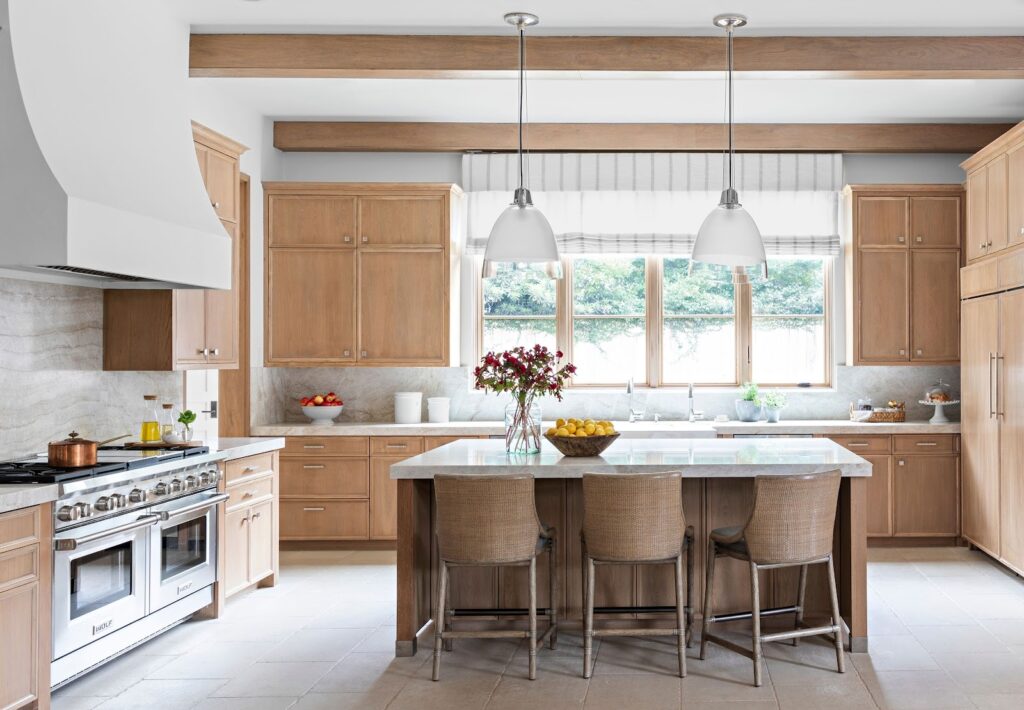
- Why it works: Warm whites or soft creams keep kitchens feeling bright and open, especially useful if the kitchen doesn’t get much natural light. Pairing with natural wood adds warmth and texture — avoiding the “sterile” feel of stark white. (minocabinet.com)
- Best for: Small kitchens, apartments, modern‑minimal interiors.
- Style notes: Often goes well with neutral backsplashes (white subway tile, light stone), matte‑black or brushed‑nickel handles, light or medium‑tone hardwood/tile floors.
Design tip: Use wood on lower cabinets or islands, white/cream on uppers for a balanced, airy look and to prevent heavy feeling on top.
2. Sage / Olive / Moss Green + Brass or Matte Black Hardware
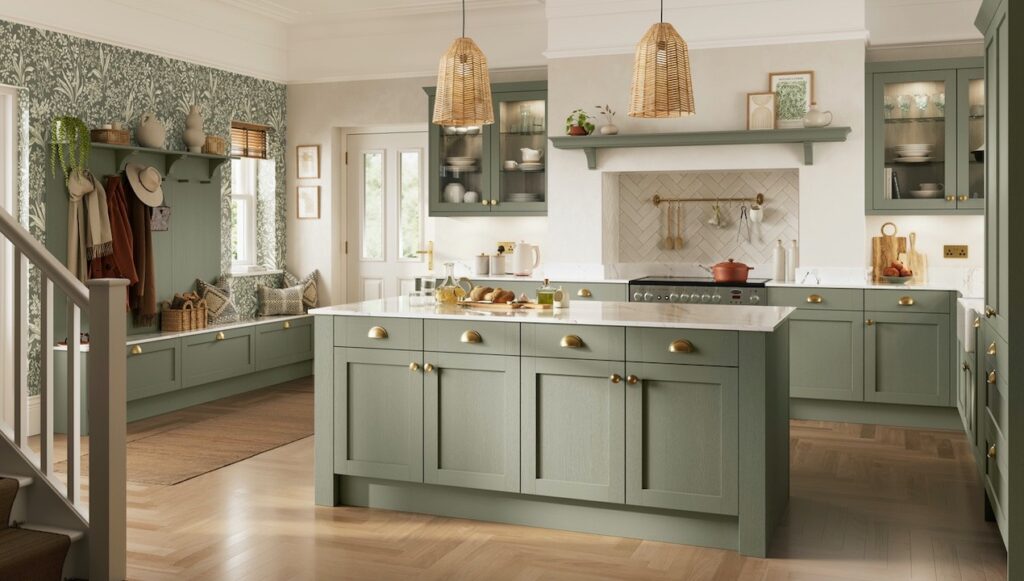
- Why it works: Green brings a calm, organic vibe — it’s restful and connects interior to nature. In 2025, muted earthy greens like sage and olive are especially trendy. (Knotty Nuff Wood)
- Best for: Homes wanting a subtle but distinctive style — modern farmhouse, Scandinavian, rustic, nature‑inspired spaces.
- Style notes: Pair green cabinets with light countertops (white, cream, light grey), natural‑wood shelves or floors, and brass or gold handles for a warm, sophisticated contrast.
Design tip: Use green on lower cabinets or islands; or apply near natural light windows — darker greens look best with balanced light to avoid a closed‑in feel.
3. Deep Navy / Teal / Dark Blue (Lower Cabinets or Islands) + Light / White Upper Cabinets
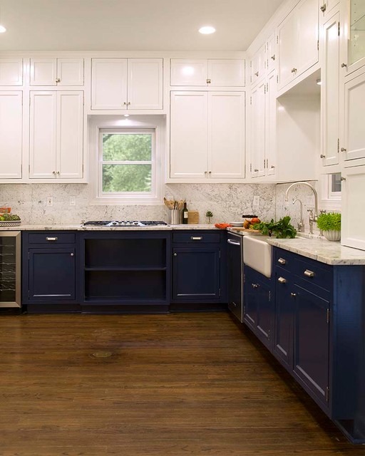
- Why it works: Bold yet timeless — navy or dark teal adds depth and character without overwhelming the room. Using lighter uppers balances the heaviness and keeps overall look open. (Klappenberger & Son)
- Best for: Medium to large kitchens, kitchens with good natural light, or homeowners wanting a statement kitchen without going too dark overall.
- Style notes: Works beautifully with white or light grey countertops, marble or quartz, and brushed‑gold or chrome hardware for contrast.
Design tip: Choose matte or satin finishes so the dark hue looks rich but not harsh. Combine with warm lighting to soften the mood.
4. Warm Taupe / Greige / Soft Grey Cabinets — Timeless Neutral Choice
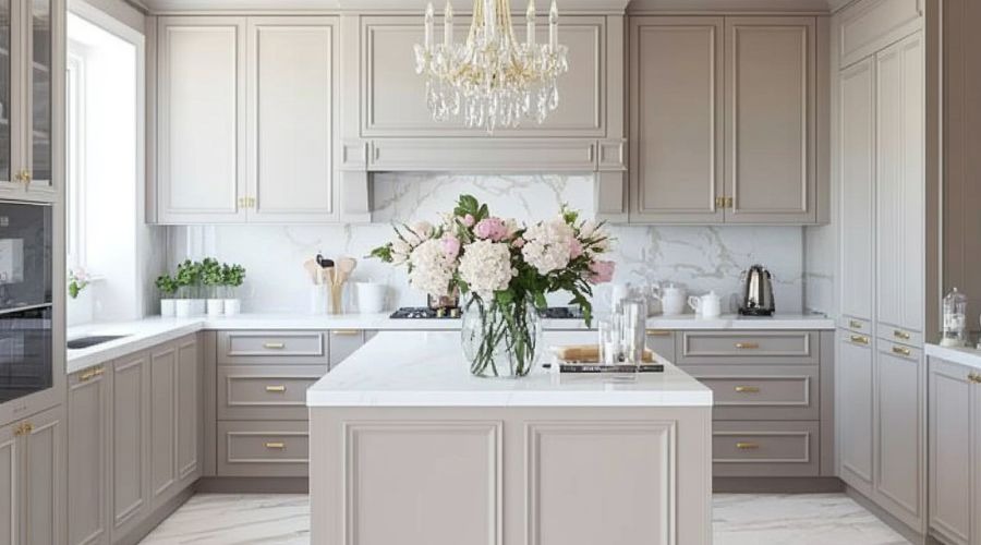
- Why it works: These hues blend neutrality with warmth — softer than stark grey or white, more contemporary than beige. It’s a safe yet stylish choice if you want flexibility for future décor changes. (Cabinet Cures of The Triangle)
- Best for: Transitional kitchens, homeowners who want neutral base without boring.
- Style notes: Pair with stone or quartz countertops, stainless‑steel appliances, and subtle hardware in brushed nickel or black.
Design tip: Add personality with accessories — colorful kitchenware, vibrant backsplash tiles, or textured rugs — while keeping cabinets neutral.
5. Two‑Tone Cabinets — Light + Dark for Balance & Contrast
- Why it works: Two‑tone cabinetry combines the advantages of light and dark colors — light on top keeps space feeling open; dark below adds grounding, depth, and hides lower‑cabinet wear better. (Like Cabinets)
- Best for: Kitchens of any size; especially useful for open‑plan spaces where you want cabinets to double as design elements.
- Style notes: Common pairings: white / cream upper + navy/charcoal/green lower; greige upper + wood lower; or vice versa depending on your workflow and space.
Design tip: Keep hardware consistent (e.g. same finish) across both colors so that the kitchen feels unified despite the contrast.
🧩 How to Choose Cabinet Colors Based on Your Space & Lifestyle
Here’s a quick roadmap to match your home to the best cabinet color approach:
| If you want… | Go with… |
| A bright, clean, classic kitchen | Warm white / soft white / light cream cabinets |
| A cozy, natural, organic vibe | Sage/olive green + natural wood or warm neutral |
| Bold statement / modern luxury feel | Navy, deep blue, charcoal, or two‑tone dark lower + light upper |
| Flexibility and long‑lasting neutral base | Greige, taupe, soft grey — easy to update décor over time |
| Balanced contrast and design interest | Two‑tone cabinets (light upper + dark lower or vice versa) |
Other practical tips:
- For small kitchens or low‑light rooms → prefer lighter shades (soft white, cream, greige) to keep space airy.
- For larger kitchens or open‑plan homes → darker or bolder colors (navy, green, charcoal) work nicely.
- Mix materials and finishes — e.g. painted cabinets + natural wood shelves; matte cabinets + glossy countertop — adds depth.
- Hardware & lighting matter — a good handle, faucet or under‑cabinet lighting can dramatically change how color reads.
🏡 Real‑Life Examples from U.S. Homes (2025 Trends)
Example A — Light + Wood Scandinavian Style Kitchen
Soft white upper cabinets, light oak lower cabinets, marble countertop, minimal chrome hardware. The result: bright, airy, clean look — perfect for small kitchens or apartments.
Example B — Sage Green Cabinets for Natural Calm
Lower cabinets in sage/olive, upper cabinets or open shelves in light cream/white, paired with wood flooring and brass handles — peaceful, grounded kitchen with a contemporary‑farmhouse vibe.
Example C — Two‑Tone Navy Lower & White Upper Cabinets
Lower navy / teal, upper white, with brushed‑gold hardware and quartz countertops. Bold yet balanced kitchen with modern character — ideal for medium to large kitchens.
Example D — Warm Greige / Taupe Cabinets for Subtle Versatility
Full cabinetry in taupe or greige, paired with stone countertops and brushed‑nickel hardware. Neutral but rich background — easy to accessorize with colorful kitchenware, backsplashes, or decor later.
✅ Final Thoughts — How to Make “Cabinet Colors USA” Work for You
Picking the right cabinet color combination doesn’t have to be overwhelming — but it deserves a bit of thought. Here are some closing tips:
- Match color to space and light — think about natural light, size of kitchen, overall layout before picking dark vs light.
- Think long‑term: neutrals and timeless combinations age better, but bold combos add character.
- Test before finalizing — paint swatches or small doors in your space to see how light affects color before committing.
- Use accessories for versatility — backsplash, lighting, handles, rugs — these can change the mood drastically even without changing cabinets.
- Don’t be afraid of two‑tone — mixing light + dark cabinets gives you flexibility, balance, and design character without going overboard.